Saturday 29 September 2012

Still image analysis


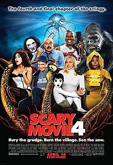
                                               Scary Movie 4


Scary Movie 4 is a 2006 horror comedy parody film and the fourth film of the scary movie franchise. Cindy finds out the house she lives in is haunted by a little boy and goes on a quest to find out who killed him and why.

This poster uses low key lighting which connotes the actors faces to be lighter than the background, moreover the filter lights are being used, the actors faces stand out. The effect is more realistic and depicts a sunny happy day. Minor shadows are created within the background. 

Back lighting is used which makes the whole poster stand out the light from behind the object creates a silhouette. The black areas which are faded away from the blue background create a scary effect, the lighting is very focused, the people animated character on the lady's lap in white could be connoting he is going to do something to her or he has some relationship with her, the characters both being white could be to represent purity, the white makes them both stand out as the others around them are in dark colours and the background is also dark. Moreover the shot is a medium shot as you can't see the actors full body and they are sitting down.


Twilight trailer analysis


Twilight is a romantic film which was released in the year 2008, it is about a teenager girl who takes risks for everything as she has fallen in love with a vampire and she would do anything for him, the vampire Edward equally loves her.

The main lighting in this trailer is ambient, this is used to show the darkness and dullness. There is a lot of dull colours used but when Edward saves Bella by stopping the van, the colour changes to orange and black. In addition the effect they have used makes the actors stand out as the background is gloomy and spooky, the lighting used gives it that effect.

The lighting used throughout the film trailer is filter lighting this connotes intenseness, they wanted to make the audience feel intimidated and make it look realistic.

 In some occasions top lighting is used this reinforces the characters and their glamorous look and it accentuates the features of the actors, the actors faces are rather pale because of this. Top lighting is used during the fighting scene when Edward is on camera.

Low key lighting is used to show the sharp contrast between the light and dark areas when Edward is fighting. Dark shadows are created within this scene. Moreover there is some high key lighting being used the actors look realistic and to show that dimly lit scene and few shadows are created within this trailer but you can't see them as much, the shadows are created as the actors stand out more. There isn't much of a contrast between the light and dark especially in the beginning


Saturday 22 September 2012

Advert analysis

                    Rihanna Advert


This is a advert of the perfume Reb'l fleur by Rihanna.

The typography used reflects towards the singer Rihanna's personality which is being presented within this advert is her sexual appeal, moreover it is a pretty font which could attract women. The name contrasts with the background as it stands out more, because its a darker colour than the background. The colours used within this advert connote smoothness and love as the colours are pastel colours which could connote this perfume is a very calm scent. The lighting is very dull yet bright, the back light is brighter than the top lighting, the back lighting has a glow at the back nearer to her feet, which fades in. In addition the typography used with her name is a very simple arial font, under the product which is being advertised - the perfume, which shows possession, as it is a product she made. 

The first visual aspect you will notice by looking at this picture is Rihanna. Her being in the advert connotes she wants lots of people to buy this product of hers, her giving that sexual pose would attract millions of people as women would think men would like this, due to her body language. Furthermore her body language and where this is taken would attract lots of people, as it is in a bedroom, so therefore it is eye-catching especially for the men, they would want to gift it to there wifes. 

Rihanna's facial expression within this advert is rather sexual, its a little pout which connotes her personality. Rihanna being in this advert makes this an celebrity endorsement which automatically makes her fans wanting to buy it, which makes the perfume a successful product. Moreover the shot is a long shot which shows her whole body, which connotes that she wants to sexual attract people due to her body language as well.

The target audience of this perfume would be teenagers 16+ to adults, as they are the ones who would want to attract men. Moreover men could be a target audience for this product as they could be sexually attracted to this poster and they want to buy it for their wifes. Rihanna is a female so she would want other females to be the ones getting attracted to men.

Thursday 13 September 2012

Media Consumptions

Media Consumptions

Newspaper
  • I'm not really keen on reading newspapers, but I do at times when I have nothing to do I read the sun or daily mail, as they are the ones which have a lot of information about what's happening around us and they get posted to our house, sometimes I also read the Buzz magazine as it has a lot of information about the teenagers around us and what they have done, are doing or have achieved. 
  • I would turn to the section which has more about the community and what's happening around us.
  • I wouldn't turn to the political or the sports information as I'm not a big fan.
  • I like reading mysterious or crime stories as it gets me more engaged and I get to know about stuff happening around me. 
  • No, nobody in my family reads newspapers but they get posted to our house so sometimes I read it. 
Magazines
  • I occasionally buy the vogue magazine, as it has a lot of information about the new trend of clothing, and how people could dress and I love clothes. I also read TV choice and OK sometimes to catch up with celebrity gossip.
  • I enjoy reading about the latest trends and fashion, but I also enjoy reading the TV choice and OK magazines as it has a lot of gossip about TV stars. I wouldn't read a magazine which has stuff about sports as I'm not interested in it and don't have much knowledge about it. I flick through the magazine and occasionally turn to the horoscope section as I find it interesting and sometimes it is true, but not always.
Television
  • I'm not sure, I think I watch approximately 45 hours a week? It depends what I'm doing, as I have a lot of work to be doing so I don't have time to watch much TV anymore.
  • I watch T.V during the afternoon and evening and sometimes during the morning whilst I'm getting ready for school or to go out. 
  • I enjoy watching X-factor, Big brother, Hollyoaks, Friends, Don't tell the bride, Jeremy kyle show and many more on ITV, Comedy central, living and sky movies. I enjoy watching theses shows as they entertain me and keep me engaged, as they have good solid plots, they either make me laugh or are serious. 
  • I watch T.V sometimes alone at night in my bedroom or with my family. 
  • Whoever, if I'm with someone older than me then they decide or if it's someone younger I decide or we flick through the channels if anyone likes anything we watch that sometimes, but most my family enjoy watching the same thing apart from my granddad he likes watching the news about countries around the world.
Radio
  • I enjoy listening to KISS100 and Capital due to the music they play as it appeals to me and my taste. 
  • I approximately spend about 1 hour listening to the radio per week because I usually listen to music on my laptop or phone and I've downloaded the music.
  • I normally listen to the radio when I come back from school or before I go to bed. 
  • I don't like stations which play rock or opera because they are so boring and have no meaning, moreover I don't understand the music.
  • Whilst listening to the radio I'm either in the car going somewhere, cleaning up my room or just sitting down reading a book with low volume music playing, sometimes I dance randomly to music, when I'm bored.
Cinema
  • The latest movie I've seen in cinema would be 'Ted' and 'The dark knight rises' 
  • I've watched 'American Pie', 'SKET' and 'Paranormal activity 3'on T.V recently.
  • I watched the film with my best friends,in cinema and at home on T.V during a sleepover.
  • I decided what films I wanted to watch in Cinema and the ones I watched on TV my friends decided, but we all like similar movies. 
Internet
  • I use the internet every single day whether its on my phone or laptop.
  • I access the internet from home and at school for work. 
  • The main websites I go onto are Facebook, Twitter, YouTube, Google, My blog and online shopping websites.
  • I go onto are Facebook and Twitter to communicate with my friends, YouTube for music and videos, Google for researching stuff for work and my blog to do my homework on or change my appearance, such as the layout and background. I also do online shopping, which I use various sites for e.g. New Look, Republic, River Island, H&M and Matalan and more.
  • I also use Microsoft word, Windows media player and Skype to contact my family who are in different countries.


By Rashmi Sharma  12M 

Wednesday 12 September 2012

Orphan analysis


ORPHAN film poster analysis


This is a film poster of "Orphan" it's a horror movie, it came out in the year 2009.The image is of Esther, the ‘Orphan’ who has been adopted by a married couple, who already have two other children. She had mental problems and had nightmares about being haunted by the demons from her past.

Firstly, the use of the colours on this poster is a contrast of black and a glowing green. The green used in the background makes the Orphan Esther's face stand out. The use of colours may connote evil as they are gloomy colours. The type of greenish blue dress Esther's wearing shows she has an old fashion posh dress sense, but this is also a stereotype as people who wear clothes like her are usually posh. Around her eyes and jaw there is a black shadow, this gives her a more skeletal look. The muddy light greenish effect shows envy around her face Esther is highlighted in many places to make her look more sinister. Esther's pale face gives the sense of horror which contrasts the difference between her and the other characters. It is a close up camera shot, shows very little background and it mainly concentrates on the face and the detail of mise en scene. The medium angle which enables us to be able to see her facial expressions clearly, but also allowing us to see some of her clothing, and this provides space for institutional information, date, website and the tag line

There are two tag lines on this poster which are in capital. so stand out more, there is one big bold one at the top saying 'THERE'S SOMETHING WRONG WITH ESTHER' this instantly tells the audience that Esther is the one on the poster and she is the main character. The font being white on a black background makes it stand out more. Moreover the thing that's wrong with Esther isn't revealed, so its a mystery, which would get the audience thinking and wanting to know. The second tag line is at the bottom is a blood red colour which is slightly smaller and it says 'CAN YOU KEEP A SECRET?' it is in a red font which could connote danger, on the other hand the colour red reinforces stereotypes of something being in red is dangerous. They haven't told us what the secret is which intrigues the viewer and makes them wanting to know the plot of the film, which would also encourage them to watch the film. This embarks people to watch the film who are into horror films and 16-20 year olds.

The font used in the title 'Orphan' seems to be in the style of a kid's writing, this links in with the story line, as its centred around a young girl. The title stands out as it is highlighted with a small amount of glow and the scratchy effect which could indicate violence and horror. In addition the title is on top of her clothing, so it is clear that she is the 'Orphan'. The title contrasts with the tag line as the title says Orphan and within the tag line it says Esther which is the girls name, so it is very clear the Orphan is the girl called Esther.


By Rashmi Sharma  12M